Back to Top
A design system for streamlined development, and better product functionality and visual cohesion
OVERVIEW + IMPACT
In summer 2023, as the sole designer at Tango—a B2B SaaS startup—I designed and shipped a comprehensive design system for our web-based product suite. In early 2024, I completed a library of mobile-friendly styles and components.
Feedback from our developers emphasized the ease and speed of building new features that utilize the design system. Company leadership expressed satisfaction with our elevated product aesthetic.
Timeline
Web: 2 months (summer 2023)

Mobile: 1 month (February 2024)
Context
Tango is a fintech startup building an all-in-one software system for restaurants. The natively-built product suite includes point of sale (POS) devices and a web-based control centre (Admin) for labour, inventory, and sales management. Products span web, tablet, and mobile interfaces.
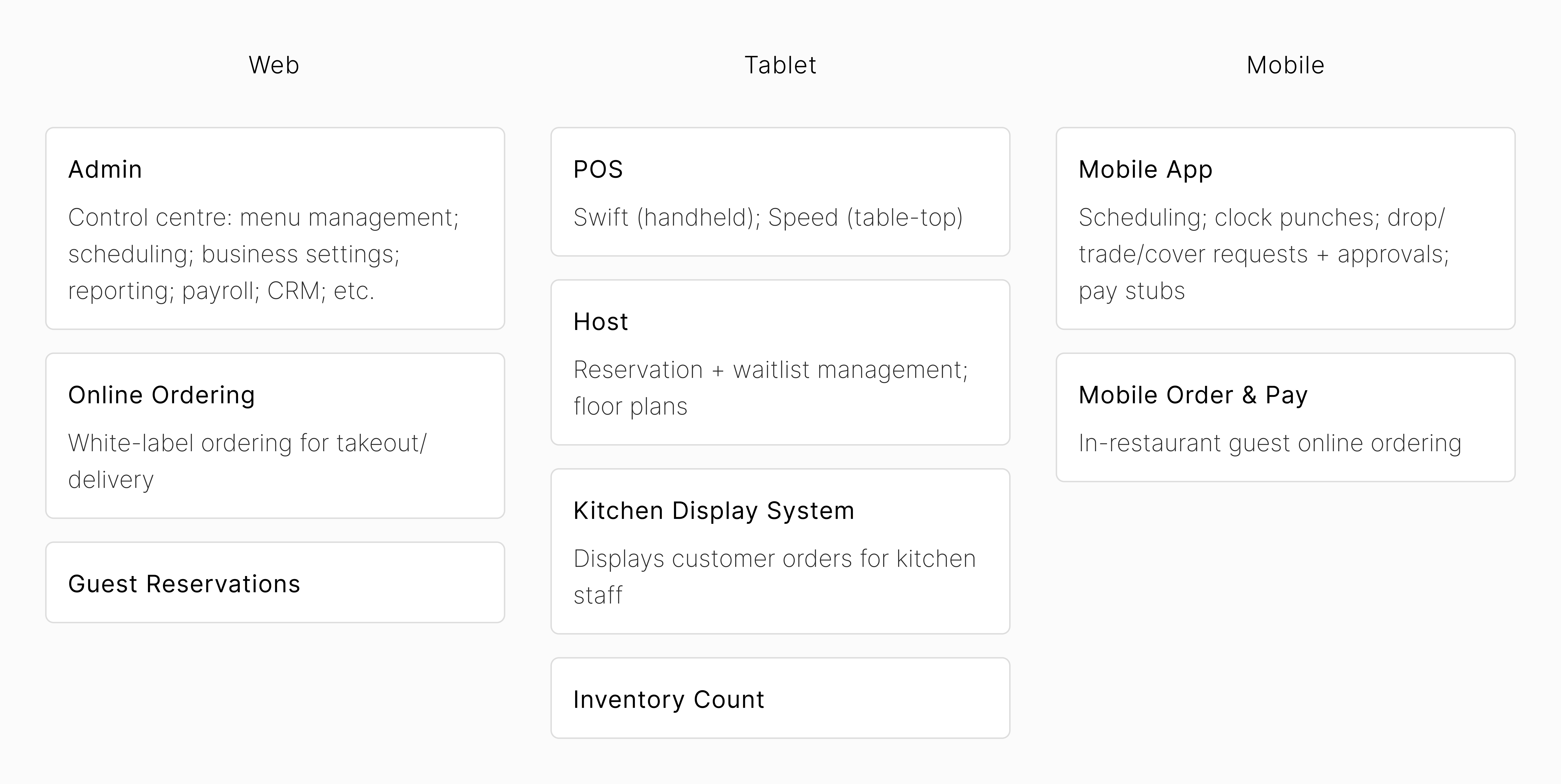
Tango product suite
As the sole designer on the team, shortly after joining in summer 2022, I started compiling a UI library for Admin, largely by amalgamating components from existing screens. In summer 2023, business started to ramp up, and with new clients set to onboard, my CEO and I discussed overhauling our design system.
We knew we needed a more standardized approach to develop new flows and features on our evolving product roadmap. We also sought to update the product to have a more cohesive look and feel.
My Role
My responsibilities included research and design, as well as close collaboration with two developers to accurately build out all components’ states and interactions. 
Goals
Streamline the design and development process
  • Given the necessary fast-paced nature of our development cycle, it was very important to build consistent and easy-to-update components.
  • Standardize development: Constructing reusable layouts/templates would speed up the UI phase of projects, on both the design and engineering fronts.
  • Increase scalability: Improving team alignment and productivity, in order to better allocate time and resources.
Improve customer experience
  • Preparing for a subsequent design overhaul of our product suite, to create a more cohesive experience for our clients (functionally and visually).
  • Improve user trust: Building reliable, straightforward, and consistent UX/UI, to help users accomplish tasks efficiently.
Kickoff
To get started with the project, I conducted a UI inventory of our existing screens. I discovered many component and style inconsistencies. Our company’s business model was based on our composable software: a modular product suite in which each feature could be used on its own or altogether. Before I joined the team, features were designed at different times in varying UX/UI, and screens were mostly hard coded. This resulted in a hacky development process and a lackluster client experience.
Tango’s overarching approach was one of no-frills simplicity. While the product is complex from a technical perspective, the goal was for our users’ experience to always be straightforward and intuitive. As such, I endeavoured to create minimal and sleek UI with clear-cut affordances.
I also sought to design with scalability and flexibility in mind, incorporating modular/nested components as much as possible.
Research
To gather inspiration, I researched other companies’ design systems (e.g. Shopify’s Polaris, Apple’s macOS, and Google’s Material Design). I also analyzed the UI of software tools I used often, taking note of which components and interactions added to or detracted from my overall user experience.
My ideation process involved copious analog note-taking and sketching. I made a checklist of elements and components based on having audited the existing screens, assessing our product roadmap, and analyzing standard UI library procedure.
Checklist of all components (left); colour tokens, button variants, text field spacing (right)
• • •
Design language
The design language comprises foundational visual elements that constitute Tango’s component library and product screens. In this section, I discuss typography, colour, and spacing.
Typography
The font Inter was selected for all type; it’s a sans-serif variable font with a tall x-height (i.e. distance between the baseline and median), making it a popular choice for easy-to-read digital use cases. I opted for minimal font sizing options of 14px, 18px, and 24px, the smallest of which is used for almost all components and body text.
Font sizing examples: alert, primary (left); modal, big title (right)
Colour
I set up the colour palette as primitive variables in Figma, which were then assigned to tokens in both light and dark modes. The core colours consist of grey, blue, and red spectrums. Almost all components are assigned text, surface, and border tokens that use the core colours.
Core colour codes: grey, blue, and red
In the old UI, the grey spectrum was slightly blue. I decided to update to a fully desaturated greyscale to achieve a neutral temperature feel (i.e. not cool). Additionally, I didn’t want the greys to clash with the newly-introduced blue spectrum.
Transition to fully desaturated greyscale
Blue 10 is used in call-to-action tokens in both light and dark modes. The primary button’s default, hover, and pressed states have the same colour codes across both modes.
Button component
There are also rainbow colours, which were used for tags, avatars, and sub-app icons. Tags in light mode are opaque pastels, while the dark mode default and hover states are translucent, to clearly display the white primary text.
Rainbow colour codes
Tag component
Spacing
I opted for a 4px grid as opposed to 8px, as I made frequent use of 12px spaces, given the flexibility of its divisibility by 3. Corner radii are 3px, 6px, and 12px for small components (height of 24px and smaller), larger components, and modals, respectively.
Corner radius examples
• • •
components
All components are designed using Figma’s auto-layout, and minimum/maximum height/width wherever applicable. As such, all designs are responsive and were well-defined for handoff to engineering. In creating the components in Figma, I frequently used variant, boolean, and text properties, as well as nested instances. This made subsequent use of the design system hassle-free.
In this section, I highlight various design decisions that tie into the project goals. 
Navigation
Prior to this project, the Admin UI entailed two navigation bars (navbars): top and side. Tango’s web app consisted of six sub-apps, each of which had several pages and features. When clicked into a sub-app, the top navbar had tabs for each page, while the side navbar displayed features for the selected page (i.e. a structure of sub-app > page > feature). 
In ideating the new UI, I sought to amalgamate the two (top and side) navbars, to simplify navigation. I initially worked on a side navbar with nested collapsible tabs for sub-apps, pages, and features, which I then pitched to the CEO. We agreed that it might feel overwhelming to a user to click through that many nested tabs.
I then worked on the chosen top navbar design with breadcrumbs, which thereby only displays pages and features for the selected sub-app. 
Moreover, as Tango’s client base includes multi-location enterprises, our app architecture has a preliminary level of business location selection. For example, Restaurant Chain has two locations: Business A and Business B. A staff member at Restaurant Chain would have the first breadcrumb of the navbar be a business selector (assuming the staff member has enterprise-level administrative permissions). The business breadcrumb is absent for location-level staff members (e.g general managers). 
Each dynamic breadcrumb (i.e. has a down arrow) opens a page menu on hover. In this example, we navigate from Payroll to Scheduling, within the People sub-app.
Fields
In the old UI, fields had fully rounded corner radii. I updated all fields to have slightly rounded corner radii of 6px, and fixed heights of 40px (with exception of the text area field, which has a minimum height of 80px and hugs its content). I opted for rectangular fields to promote a more grid-like, modular feel. 
Fields in default states
In Figma, I used many layers of nested component instances to plan for easy iteration. For example, the text field component has nested prefix and suffix booleans, each of which has a nested field or button. In constructing things in this manner, I had to update an element in  only one location for it to reflect globally.
Text field properties in Figma, highlighting the nested prefix and suffix components
Tables + Forms
In Admin, our users can set up menus (items, recipes, inventory), organize their staff (employee scheduling, payroll, onboarding), manage customer loyalty (reputation management, email campaigns, gift cards), and optimize operations via reporting. Almost all Admin screens incorporate tables and forms.
In the old UI, clicking into a table row would take the user to another page. In this redesign, I implemented panels in lieu of separate page navigation; the user clicks on a table item and its details panel opens on the right side of the screen, and the table header and footer adjust responsively. With this setup, the user can view/edit an item’s details whilst interacting with the table. 
In an earlier version, I planned on having the panel be expandable to fullscreen, thereby adding a breadcrumb to the navbar. However, there weren’t any discernible advantages to the wider view, and I felt that the added display option could ultimately detract from usability.
Table and panel functionality
I worked together with one of our developers to build standard form layouts. Each form field consists of a field label, and between 1-4 fields (vertically or horizontally). The different field types include text field, text area, select field, dropdown field, search bar, chips, file attachments, colour selector, stepper, and date/time selector.
Form field properties in Figma
Form example: adding a new inventory item for a vendor
• • •
mobile
Upon successful completion and implementation of the design system for web, the CEO approved my pitch to work on the mobile version. The mobile components are very similar to web, apart from slightly larger text sizing and clickable areas.
Prior to this project, we had separate UI libraries for Admin, the mobile app, and POS—all designed in distinct visual styles. I decided to meld together the mobile and POS libraries, especially given our plan to transition from two separate POS apps to one responsive design that would work for both POS tablets. See below examples of Admin, mobile, and POS screens before and after this design system project.
Admin, mobile app, and POS (handheld) before and after UI updates
Mobile app examples: login (left); customer payment details (middle); new shift details (right)
• • •
in action
I have implemented the new components in a design overhaul of Admin and in newer product features. The new UI gave rise to functionality updates regarding tables, item CRUD (create, read, update, delete), pages/panels, and navigation. The screen below is the Menu Items page within the Food & Bev sub-app, with detailed feature call-outs.
takeaways
Importance of communication
In handoff to engineering, we encountered the fewest roadblocks in instances for which I had habitually checked in with the developers while designing (i.e. confirming technical feasibility). I learned that continuously keeping everyone in the loop resulted in more efficient design and development.
Designing for scalability
With company scalability in mind, I designed modular components, enabling faster development of new features. Designing screens with reusable components and layouts also allows for easier updating of specific flows as needed.
Being flexible
While carrying out this project, there were a number of smaller, high-priority tasks that arose, regarding bugs and feature requests. I worked together with the CEO to prioritize design tickets and to stay on top of all deliverables, seeking to balancing product, user, and business needs.